Wednesday, 11 January 2012
Everything is irie :)
Hey loyal readers!... It's funny cause I know nobody reads this...
Sorry I have not made a post in a while. First it was X-Mas and then I went to Jamaica. I am back now though and ready to do some more learning and trading. While I was in Jamaica I decided not to have any contact with the outside world and just enjoy every minute of it. That being said, I never checked my stocks either... When I returned home I was pleasantly surprised by my charts :) My stock (Trevali Mining: TV.TO) Had jumped ↑30% and the charts were still looking good. So I hung on to the stock. The next day it went up another percent and still looked fine. Then the next day while I was at work it dropped 7%. I had seen it do this before though, so I hung onto it some more. Then it went up 2% more today and I sold it for a total gain of ↑24%. The stock has since dropped 3% more and still looks like it is on a downward trend. Overall I am happy with my decision and my return. Now I need to find another stock!
Now to get back into the chart reading stuff! So, as I was saying last time, I like to use what is called the candlestick chart. This type of chart demonstrates trends, highs and lows for any time period along the time line, as well as volume and can help you to get a better understanding of your stock. I recommend using this type of chart. You can tell a lot about what a stock is going to do by learning about candlestick patterns.

These are some very important patters that you are going to want to learn ASAP. Today I will tell you about the first one.
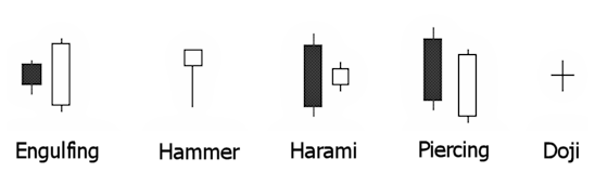
The Engulfing Pattern:
Each candle represents a time period depending on the time line of your chart. To make this easier lets pretend each candle represents a day. From the first candle you can see that the sellers are in control of the stock. However the volume of sellers is pretty low. they are not very aggressive. You can tell because the distance between the top and bottom (high and low) are not very far apart. and the "wick" is showing on either side. The second day is a wide range candle that "engulfs" the previous day's candle. You can see right now that the demand is greater than the supply. This will drive the price up. When researching a stock you want to see patterns like this. Take a good look at the long term time line to see if you can notice any trends. Remember: History always repeats itself. If the stock you are interested in has recently went through a downward trend and you start to see patterns like this, it is a very good indication that it is on it's way back up again. If you see the reverse of this pattern it means the exact opposite. If you see a small white candle being engulfed by a large black candle, you may want to stay away.
Thanks for reading. Next time we will get into the Hammer candle.
-James-
Sorry I have not made a post in a while. First it was X-Mas and then I went to Jamaica. I am back now though and ready to do some more learning and trading. While I was in Jamaica I decided not to have any contact with the outside world and just enjoy every minute of it. That being said, I never checked my stocks either... When I returned home I was pleasantly surprised by my charts :) My stock (Trevali Mining: TV.TO) Had jumped ↑30% and the charts were still looking good. So I hung on to the stock. The next day it went up another percent and still looked fine. Then the next day while I was at work it dropped 7%. I had seen it do this before though, so I hung onto it some more. Then it went up 2% more today and I sold it for a total gain of ↑24%. The stock has since dropped 3% more and still looks like it is on a downward trend. Overall I am happy with my decision and my return. Now I need to find another stock!
Now to get back into the chart reading stuff! So, as I was saying last time, I like to use what is called the candlestick chart. This type of chart demonstrates trends, highs and lows for any time period along the time line, as well as volume and can help you to get a better understanding of your stock. I recommend using this type of chart. You can tell a lot about what a stock is going to do by learning about candlestick patterns.
These are some very important patters that you are going to want to learn ASAP. Today I will tell you about the first one.
The Engulfing Pattern:
Each candle represents a time period depending on the time line of your chart. To make this easier lets pretend each candle represents a day. From the first candle you can see that the sellers are in control of the stock. However the volume of sellers is pretty low. they are not very aggressive. You can tell because the distance between the top and bottom (high and low) are not very far apart. and the "wick" is showing on either side. The second day is a wide range candle that "engulfs" the previous day's candle. You can see right now that the demand is greater than the supply. This will drive the price up. When researching a stock you want to see patterns like this. Take a good look at the long term time line to see if you can notice any trends. Remember: History always repeats itself. If the stock you are interested in has recently went through a downward trend and you start to see patterns like this, it is a very good indication that it is on it's way back up again. If you see the reverse of this pattern it means the exact opposite. If you see a small white candle being engulfed by a large black candle, you may want to stay away.
Thanks for reading. Next time we will get into the Hammer candle.
-James-
Subscribe to:
Posts (Atom)